Stanford MENA Forum
-
Scope
/ BRANDS
Brand Strategy, Visual Identity Systems, Typography, Messaging Frameworks, and Print & Packaging.
-
Client
Stanford University
-
Location
Palo Alto, California, USA
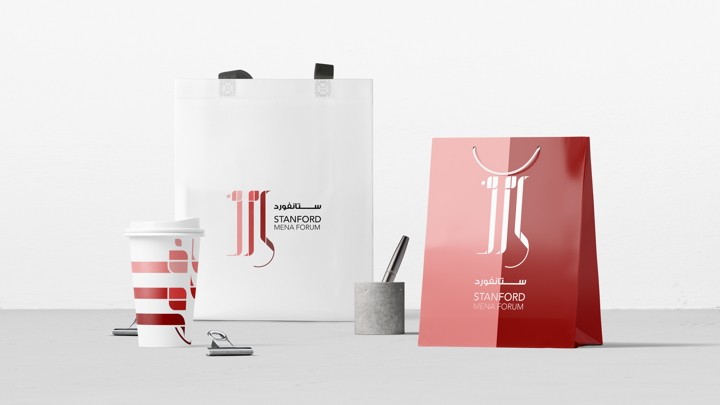
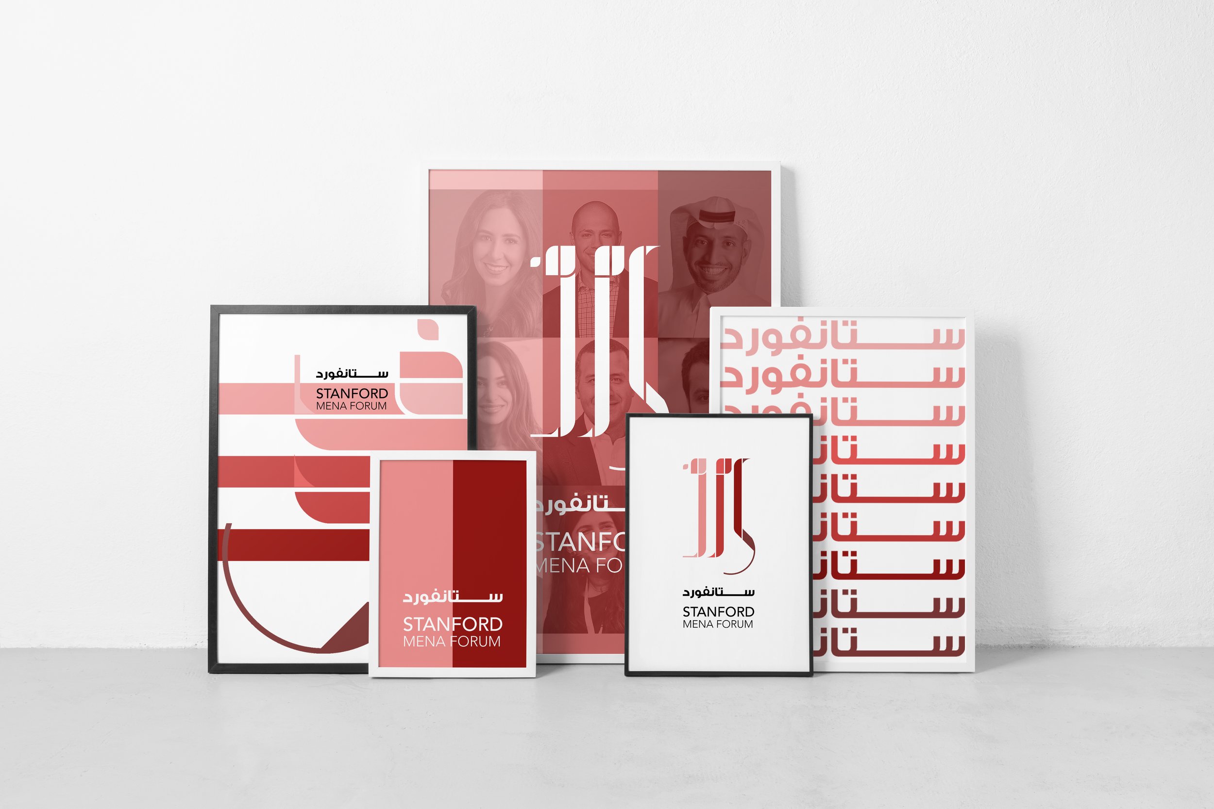
The logo evokes the feeling of change, growth, novelty, and resilience.
The Arabic language is perhaps one of the most integral commonalties of the an otherwise disparate and expansive region, so we used the forum’s acronym in Arabic letters س م ف (S M F) as its emblem. Additional key elements in the logo are its verticality and color gradation, which allude to change and growth – the theme of the forum.
The color palette is an extension of Stanford University’s brand. In its analogous color palette, incremental color saturation, and overall form, the logo evokes the feeling of change, growth, novelty, and resilience – all core values that are pivotal to our region.


